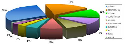
I’ve used the same method of popularity calculation as in case of Digg.
So, here we go with the chart:

And here comes the popularity diagram:

And finally, the graph about how the demand on a separate topic was changed during the evaluation period. Click on the preview below to see the full picture.

That’s all for now. Come back later to check for other stuff I've observed.

